Sunday 19 May 2013

Tutorial 03: How to paint a furry cartoon dog in Adobe Photoshop

How to paint a furry cartoon dog in Adobe Photoshop


It's been a while since I posted my last tutorial, but I finally got round to doing another!

This tutorial assumes you have some basic knowledge of Adobe Photoshop, if you don't, you can see my beginners tutorial here

Things you'll need;

Computer / Laptop
Adobe Photoshop
Graphics tablet

To begin...

It helps to have a sketch of your idea already. For this tutorial I'll be using this guy;


The aim is to have him looking fun and cute in a cartoony way, whilst having the 'realistic' fur texture and painterly details. I don't want him to look like a real dog, but he shouldn't be a vector either!

To start, open up your Adobe Photoshop.


If you have a sketch already, open that file at a decent size to be working on. We will be zooming in and once you've created your art in Photoshop that's the size it will stay - so make it as big as you need it!


You want the sketch as a base layer underneath your art, so in the layers panel create a new layer. 


As you can see in my sketch above, it helps to set the Opacity of the layer down to around 30 or 40% when working so you can see what you are doing. The Opacity is right above the layers in the layers panel.

Keep this sketch layer in the very top of your list in the layers panel. Click on the eye icon to the left of the layer, which makes it invisible. When you need a guide, just click on the eye icon again to see the guide over the top of your painting. 

This is a great way of using a sketch or picture as a guide, without letting it influence your creative painting! You can flick it on or off as you need, or to check you haven't strayed too far from the original sketch.

Now lock the layer the sketch to prevent you accidentally painting onto it, by selecting the layer and clicking on the lock icon above it.

Saving...

I'm only going to mention this once, but I can't stress how important this really is! You must save your work as much as you can. Get into the habit of saving after every 5 minutes - don't think I'm exaggerating!

After you've worked on a project for 5 hours, when you lose everything because your computer 'crashed' you will not want to do the whole thing again.

Creating a base...

Now that you're set to draw, you need to create your base. I start by using the paintbrush tool on 100% Opacity, and block in the figure that I'm drawing. In this image I have already completed the legs and body, but the same technique applies to all parts. 

What I find useful is if I separate the body parts into their own layers, this means I can move and edit individual bits without effecting the rest of the image - saving me time and effort. 


So I've roughly blocked in my dog's head. The colour is not entirely important but try and pick one relatively close to what you want to end up with.


Using the 'magic wand' tool in the tools panel, select your colour block to get the moving line around it.

Work from the bottom, upwards...

It's the general rule in digital painting to work from the bottom upwards. 

So think about how dark you want the darkest areas of your image to be, and select that colour in the tools panel.


Once you have the colour ready, you need to select your brush. 

This may differ from the tutorial depending on what you are drawing, Photoshop has a great range of pre-loaded brushes, but you can also find hundreds of free brushes out there ready to add to your collection. 

I'm trying to create a fur-like texture, so I select the 'round fan stiff thin bristles' brush. You may have to test and play around for a few before you find the one you like.

You can see all the brushes by clicking on the toolbar that runs across the top of the page. 


The size, again, depends on what you're painting, so try a few and find one that suits. 


The first stroke...

The 'undo' tool is your friend here. The only problem for me is that it doesn't go back far enough! I'll admit it, I make mistakes and undo things a lot as I go along. You can undo from the top menu using Edit... Undo or you can use a keyboard shortcut if you have one, mine is Command & Z

Be bold, and confident. 
If you're shaky and unsure, your lines will be shaky and unsure. I tend to work better when my movements are faster and more like traditional painting. Work in the direction of the fur to give it a realistic and smooth feeling.


If you find your lines are too bold and strong, you can turn the Opacity and Flow down on the top bar.


I generally keep them around the same number but mess around and see what happens - you can get huge differences in your strokes by playing with these. I am continuously moving these sliders around while working to get the best look when painting.


As I said before - work your strokes in the direction of what you're drawing. This will really give your painting shape and form, rather than just a flat picture.

The first stroke...

Next I choose a slightly lighter colour - this is what I would consider my main colour. 


I set the brush to a much lower Opacity and flow - around 50% and cover the darker strokes, and try and cover the 'base' colour which we blocked in with at the beginning.


It's around this time I deselect the magic wand I used earlier, so that my strokes can run anywhere on the page - previously they were contained to the shape of the dog's face.

It now takes much more care to not distort the shape, but you can let the fur effect take form instead of a  cut off line around the image.


I know, it looks hideous, but we're not done yet! You can see the face taking shape even at this stage, which is why the strokes are so important.


Using the same technique I add some lighter colours to the fur - and darker fur where the eyes, nose and ears are. 

If you're unsure what bits should be darker and lighter, or which way the strokes should flow - don't guess! Do a quick google search on your image and don't be scared to use references. It's not cheating, it's drawing from real life, sort of.


Adding details...

Any new 'part' you add should be kept on a separate layer. So we make a new layer for the nose...


And begin by blocking in the base, as we did with the head. Make sure you put the 'nose' layer above the 'head' otherwise you won't be able to see it!


Using the paintbrush at 100% Opacity I blocked in the nose shape. As before, I also selected this with the magic wand tool.


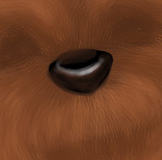
I want to add highlights to the nose - so I make the brush smaller, and turn down the Opacity and Flow to about 20% - it's so faint that I have to go over my strokes a few times to see any effect, but this gives me great control and looks better when finished.

I use the 'hard round' brush - because I don't want furry strokes in the nose!


As you can see I also added some ever so slight red - because dog's noses are not always fully black. It's this attention to detail that will really pay off in the end.

The nose right now sticks out like a sore thumb (huh?)

So I go back to the 'head' layer, and using the same brush fill in some shadow under the nose. 


Much better. Next is the mouth! Remember to make a new layer...


Using the paintbrush with about 40% Opacity, I give myself a guide. Then I use this guide to build on, as before, with a base and working up. I made my paintbrush much smaller for these thin lines.


It doesn't look quite right... what have I missed?


Much better! Now that's done, all that's left is the eyes.

The eyes...

I love drawing eyes, they really bring the image to life and convey emotion.

To begin with, I use the paintbrush at 100% Opacity and create the eyeballs.


Zoom in close up, there's no point in working miles away and struggling to see - just make sure you zoom out every now and again to see what it looks like with the rest of the picture.

Just like I did with the nose, I'm giving the 'head' layer underneath some darker areas so the eyes sit better.


The eyes are still too perfectly round, they look too clean cut! Take the paintbrush at a small size and lower the Opacity a little, then go around the eyeballs and make them slightly less 'perfect.'


Add some grey shading, to make the eyes look like balls instead of flat circles...


And blend these in using a low Opacity white.


Add some black circles, using the paintbrush with 100% Opacity


Inside those pupils, add some colour for the Iris and black for the pupils. I wanted my dog to have intense, yellow eyes, but you can choose any colour you like of course.


Now using the same method as we did with the nose, blend the black, yellow and black into each other. I even added some darker yellow to give the eyes depth.


The last touch is a gleam of white highlight in each eye, and there you have it!


His ears to me still look a bit undefined, so I went back to the 'head' layer and re-worked them a bit.


Now I feel the dog should have a tongue! The beauty of working with layers is that I can go back to the mouth layer and add one.


Perfect!

And there you have it, I'd love to hear your feedback on this tutorial, and of course I'd love to see your work if you used the same technique!




Tuesday 7 May 2013

PROJECT 365! An illustration a day!

Last year, a friend of mine took a photo that represented what she did on that day, and made a project from these photos. I loved the idea! So not being too great at photography, I decided to tackle my own project, using illustrations instead.

PROJECT 365 - An illustration a day!
(Also known as how to make sure you have zero free time for a whole year!)

For each day of the year 2013, I have been attempting to draw at least 1 thing a day. This isn't too difficult, as I do this for a living, but even my days off I have to find the time to doodle a quick sketch or work on a project for a little while.

So far so good!

You can see what I've been doing in past posts, but since I haven't updated you all for a while, this is what I've been doing recently!

27th April 2013


28th April 2013


29th April 2013


30th April 2013


1st May 2013


2nd May 2013


3rd May 2013


4th May 2013


5th May 2013


6th May 2013


7th May 2013


And that's today! As you can see I've been very busy, but I have lots of exciting new projects to share with you all in the weeks to come!

Is anyone else attempting a similar project?

Let me know what you're doing by emailing me at;


and I can feature you on my blog!

This weekend I'll be sharing another illustrator related post, so be sure to keep an eye out!

Izzy Bean


Friday 3 May 2013

Looking for an illustrator? How to find the best artist for you - a guide!

As an illustrator who specialises in children's illustrations, I often get emails from new authors or self publishers looking for artwork for their books but don't know where to start.
Any new venture can be daunting, but hopefully this post will give you some tips and advice so your adventure will be exciting as the story in your book!


So where do you begin? Let's say you've written a story for your son or daughter, and you think it's too good not to share with the world. You know you want to self publish but you can't draw the pictures yourself. There are certain things you should consider before going out into the world to find your ideal illustrator;
1. Who is your target audience?
If you say 'this book will appeal to all ages!' then think again. Illustrations styles vary depending on the audience they're intended for and books will rarely work for teens as well as they do for babies. It's essential to know who you're writing for, and don't worry about catering for the niche markets! Some examples would be;
Babies
Toddlers 
3-5 year olds
Young teens
Children with same sex parents
Children of an ethnic minority
Adopted children

2. How many pages will your book be? How many illustrations do you need?
If you're not sure yet, consider your options. Will you have a front and back cover? Will you have a dedication page or an 'about me' in your book? Out of the pages, how many of them will be illustrated? Remember to think about page binding and book size - some printers need a minimum number of pages per book. Do you have too many pages or too little? Will your text be separate from the illustrations? At this point it's good to consider the sizes of the illustrations too, are you going for 8 x 5" book? Or 5 x 8" ?!
3. What is your budget?
The first mistake new authors make is not remembering the golden rule of business… YOU GET WHAT YOU PAY FOR.
You may come across the odd student or new artist who happens to be a master of illustration yet not established enough to charge a lot, but you should be aware that there are aspects of the job that they may be a stranger to just as you are - and hiring these types may be risky, amateurish and cost you more in the long run. Illustration is not just about drawing! (Although that helps…) If they don't know how to work with bleed pages, templates or popular formats and programs then your book quality will suffer.

You can work on a small budget - and there are ways of saving money. Using one of the inner page illustrations as the front cover is a popular method. 
Don't be afraid to tell the illustrator your budget, and negotiate prices with them! If they really want to work with you, they may give you a discount or offer some sort of deal, such as taking a percentage of the royalties from sales as well as a one-off fee.
Now you know what information to give to your artist, you have to find them! 
Finding your dream illustrator
Everybody's first port of call is the all powerful Google search.

There is nothing wrong with this, except you will notice the search is dominated by Agencies. Agencies are companies that have a number of artists working under their name. There are pros and cons to using agencies to find your illustrator. 
PROS
A lot of (but not all!) agencies are strict with the artists they employ to work in their name, and so the quality should be to a higher standard. 
The agency will do a lot of the hard work, asking the right questions and getting the work done with their experience.
The agency will have artists that work in various styles and you can browse their work to find the one that suits you.
CONS
You lose the personal connection between the writer (you) and the artist. 
Adding a middle man means the cost is usually higher

Some examples of well known and reputable agencies are;

Another path to take would be the 'outsourcing' communities such as Elance, Odesk and so on. These sites work on a 'bid' system, where artists can apply for your job and you pick the candidate you like the most based on their credentials and feedback.
A quick search on the internet will find a never-ending argument between the fans of these sites, and the critics. However they can be helpful and certainly cheap for the self publisher. These sites must be used with care - be sure to follow their rules and you may just find the illustrator of your dreams at a price you'll love!


Just remember anyone can sign up to these sites. Be sure to check the artist's background and portfolio before jumping into an agreement, and beware of scams.
Searching for that special someone may take time, but the search is worth it. Don't jump into bed with the first artist whose work you like; narrow it down to a select few and choose wisely. The are some important factors to take into account at this point.

PORTFOLIO
If the artist doesn't have doesn't have some sort of portfolio, then they're not worth your time. Portfolios can be in any form, a website, a blog, a PDF, a folder full of paintings, and so on. 

You need to be looking for quality and style in the portfolios. Don't get wrapped up in the shiny, special effects of a website if the work on there is mediocre. Do the images look professional? Is there a style there that suits your book? What is the subject matter? There is no point asking an artist to illustrate your cute book about baby bears if their portfolio only shows dinosaurs fighting robots. Their work might be good, but if it's not for you then move on. 
What to look for;
Work that has been done for previous clients. Does the artist have any published work? Any books they have completed? Have they worked for any big name brands?
Work that has been done recently. Does the artist's portfolio seem old and stale? Or is it constantly updated with new work?
Passion. Does the artist love what they do? Are they happy with their work? Do they seem to enjoy it? Are they proud of it? Does this show in their work?
What to avoid;
Work of a less than professional quality. Is the work clean and clear? Or is it a photo of a scribble in a scrapbook? Are the images dark and hard to see?
Deviant art portfolios, photo bucket, etc. While these sites are fine for social networking, if the artist's portfolio is not available elsewhere this is a bad sign. If the artist is serious they should have their own domain, or at least a website exclusively for their work. Artists with blogs, involvement in the community and those who are signed up to illustrator websites show their dedication to their trade.

Hurrah! After all that searching you've finally found the perfect illustrator for you! Their portfolio looks great, they're passionate about their work, they fit into your budget and they're available for your project! But there are still some more hurdles to jump before you reach that finish line… ready?

Write a clear and reasonable contract which both of you sign.
You don't need to be a lawyer to do this, just a simple outline of what you want and how much you will pay. Make sure you are both 100% happy with what work you want, the deadlines, who owns the work and copyright, and when the payment will be sent. It protects the artist and you. If you're unsure your illustrator will usually guide you through this, but here is an example of the contract that I use - feel free to steal it and adapt it for you own needs!

Up front payment.
Each illustrator will work in their own way regarding payment. Personally I would never ask a client to pay the full amount up front, and you should be wary of anyone who asks you to do this. On the other hand, you should not expect an artist to dedicate their time and effort to you on the promise of receiving money at the end of a long project, they have mouths to feed too you know!
I find it acceptable to pay no more than 25% as an up-front fee. You can work out milestones with your artist and pay in stages if you like, talk to them and see what system will be best for you. Don't forget to write this in your contract!
Ask to see progress.
It's fun and essential to the project outcome. Your artist should provide sketches and progress shots along the way, so you can review and amend anything, provide feedback and make sure your artist is on track regarding deadlines.


Finally! The creativity can begin! After all your hard work and dedication, you'll see your ideas come to life and your vision take form!
To get the best results from your artist, remember these points!
Art takes time.
It's surprising the amount of people who underestimate the work that goes into illustrating. Books are made in months, not days and if you want the best result, don't make unreasonable deadlines for your artist.
Be clear and concise with your instructions.
There is nothing worse then a client being vague and uninterested in their  project outline, only to mention an essential piece of information after all the work has been finished! Give the illustrator as much information as possible, they won't mind, in fact they'll appreciate it! You can send them work you have already seen by other artists, photos you've taken, crude sketches you tried yourself, colour samples, links, anything you like! Don't assume the artist will pick up on obvious information; if you haven't said it, the artist will not draw it. So if your main character always has a red wooly hat on - you must say so!
Bad example 
Draw Tom watering a plant.
Good example 
Draw Tom, a 5 year old hispanic boy wearing dungarees, watering a small seed in the back of a flower-filled garden. We must see a cottage in the background, and a bird in a bush nearby. It is sunny, and Tom is happy.
Don't be afraid to say 'I don't like it.'
You should have the chance to make any amendments to the sketches before they are finalised. You may not want to offend your artist, but any good illustrator will know that it takes a few attempts to perfect your vision. If you think something is not working, be polite and clear and tell your artist!
Listen to your artist's opinions.
Don't let them take over your project, after all, this is your dream not theirs. However your illustrator is a professional in their field. They might be aware of certain things that you are not, such as image repetition, colour clashes, misinterpretations in the illustrations and more. Listen to their feedback and concerns and work with them and you'll find you have a much better working relationship that leads to a better result!


So that's it. Hopefully you'll end up with a beautiful book with fantastic illustrations to be proud of. Don't forget to tell everybody about your fab illustrator - a lot of work is through word of mouth!
Be sure to remember them when you are the next J K Rowling, or Roald Dahl. 
And good luck!

Last but not least, I am, of course, available for hire. You can contact me by emailing izzybean@izzybean.co.uk - but don't take my word for it! Shop around, look at my portfolio and ask as many questions as you like!