
*Please note, this guide was written in April of 2018. Ingram Spark constantly update their interface so your experience may vary*
New authors might notice there is very little free help when it comes to self publishing with Ingram Spark. The popular print-on-demand publisher is an excellent choice when it comes to ordering high quality print-on-demand books that can be distributed to over 39,000 vendors worldwide, but navigating the strict requests set out by the Amazon owned company leave many hiring a third party to deal with the company on their behalf which can be costly.
In this free guide, I'm going to share with you the steps I've learnt during my ten years of working with clients who choose to publish with Ingram Spark in the hopes that I might be able to make your journey to becoming a best selling author that little bit easier!
As an illustrator who offers this service, I work exclusively with children's books so this guide will involve publishing a children's picture book, but you can apply these steps to almost any kind of literature you would like to publish.
We will go through two main elements;
preparing your account and uploading your files
Because I'm going to discuss every step of the way in great detail, I have separated these elements into two sequential blogs for easy reading. This is the first blog.
Before you begin, there are a few things you should have ready.
ISBN numbers
You should have different ISBN numbers for each format of your book.
For example, the book I am uploading in this guide is Carol Baker's 'A to Z, an Aliterative Anothology of Animals' and we will publish this as a hardback, a paperback and an ebook. Therefore we will need 3 separate ISBN numbers for each version. If you're unsure how to get an ISBN number you can check out our handy little guide here; All you need to know about ISBN numbers.
Tax information
Depending on what country you live and work in, your tax laws will vary so it's a good idea to read up about what you need to be legal. Regardless of whether your book project is your main source of income or not, you should always be prepared to submit your tax information to avoid breaking the law.
Bank details
This is so Ingram Spark can pay you the royalties earned from your book. If you're trying to sell your book as a main job, you might want to setup a business bank account for these payments.
Now you are ready to start, so let's begin with...

CREATING AN INGRAM SPARK ACCOUNT
Initially, it can be daunting to fill in the information Ingram Spark asks for if you are unfamiliar with the terms they use, but it is relatively straight forward if you take your time.
- Visit www.ingramspark.com
- Click on 'Create an account' in the top right hand corner
- Fill in your details
- At this point, Ingram Spark will send you an email to verify your email address. Login to your email and click on the link to verify, then visit the Ingram Spark website again to login with your newly verified email and password.
- Accept Ingram Spark's terms of use by clicking on 'I agree'
- Fill in the required information on the next screen.
- Setup a security question
- Read and sign the agreements (note, only two of these are actually required to continue)
- Click on 'finish setting up my account'
- Select a currency and add your bank details (if you wish to get paid through Paypal, you must select US DOLLARS at this screen and Paypal will convert any payments into your local currency)
- Add a bank card
Once you've finished setting up your financial information, you can move onto adding your book. Click on the tab which says; 'Dashboard' and from here, there is a button which says; 'Add a new title', click on this to open up this page.

Now you need to fill in the information about your book. I recommend taking your time to do this properly because once you have filled everything in, it is more confusing to go back and make changes.
You now need to select the format of your book to work on. Is it a physical print or ebook? If you offer both and you will distribute them at the same time, you can choose the combined option.

Then, you can fill in the main information about your book.
Title - The title of your book
Subtitle - The subtitle of your book, leave this blank if you don't have one
Language - The main language your book is written in
Short description - You can use the blurb from the back of your book
Keywords - Research some popular and relevant keywords relating to your book's subject
Series name and number - If your book is not part of a series, you can leave this blank
Edition description - Only fill this in if your book has different editions, different formats (such as paperback or hardback) are not included. Otherwise leave this blank
Full description - This would be an extension of the short description above. You can use a more in-depth discussion of what your book is about, similar to what you might send to a potential agent or publicist.
Continue to the next step, where you see this screen;

Add any contributors you would like associated with your book, such as illustrators and co-authors then click on continue. Now you will see more boxes to fill in. It is important to fill these in honestly and accurately, because they will form the 'metadata' that is attached to your book. If your metadata is inaccurate it may mean that your target audience cannot find your book.
Imprint - This is defaulted to your business name, which is listed as the publisher data instead of 'Ingram Spark'. At first, your name might not appear because you are a new account, but you can continue as normal and come back to this in a couple of days to select your name.
Subject - Choose the main subject that your book is about, you can select more than one if you need to
Region - If your book includes a real place or country in the world, you can select it here
Thema - This is a global subject that is featured in your book
Audience - Choose the audience your book is targeted towards
Table of contents - If your book has a table of contents, you can write it here
Review Quotes - If your book has been reviewed positively before, you can write quotes from the reviews here
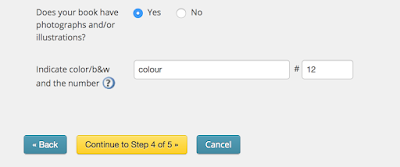 In the options at the bottom, tick yes if your book has illustrations or photographs included, and in the first box fill in either 'b&w' or 'colour' depending on what your illustrations or photos are. If you have a mix of both, write 'colour'. In the smaller box next to it, enter the number of illustrations or photos that are included.
Now we move onto adding more technical details about the format of the book itself. It is very important to know the exact details here, if you have an illustrator or designer handling your book, make sure what you enter here is what they have been using to prepare your files.

Trim size - This is what size your book will be AFTER printing
Interior colour and paper - This is the paper quality that the INSIDE of your book is printed on. Your preferences and budget will determine which one you choose. If you are unsure what the difference is, check out this great post about the options.
Binding type - This is what the OUTSIDE of your book will look like. If you are unsure what the difference is, check out this great post about the options.
Trim size - This is what size your book will be AFTER printing
Laminate type - This is what finish the cover of your book will have. If you are unsure what the difference is, check out this great post about the options.
Page count - This is the number of actual pages (not sides of a page) your book has. All pages are counted so include any blank pages. Since one page has two sides, it should be an even number.
The next page will include details about the pricing of your book. In the top box, you can enter the ISBN that is associated with this version of your book. There is an option to assign a non-distributable ISBN, but I would not recommend this unless you are making a book that you don't intend to sell or distribute.
In the following boxes, you can enter the retail price of your book for each country. You should have already thought carefully about how much you want your book to be, paying special attention to how much each print will cost and how much you need your profits to be. You'll notice a box called 'Global connect program.' This is Ingram Spark's program that allows publishers anywhere in the world to print and distribute your book. As long as you are happy to sell worldwide, you can tick this box and enter the price.
On this page you can also set rules about returns and wholesale discounts. Take note of the number that appears at the end of each column - this will be your earnings for each sale. If it is red, it is a negative balance and you won't be able to continue.
Publication date - This is the date your book will be published
On sale date - This date is the first date your book can be sold. You can leave this blank and it will automatically be the same as your publication date
At this point, you should see a prompt to start uploading your files, well done! Visit my next blog post to follow the steps to upload your files and continue using Ingram Spark to publish your book.
Next: Preparing and uploading your files


